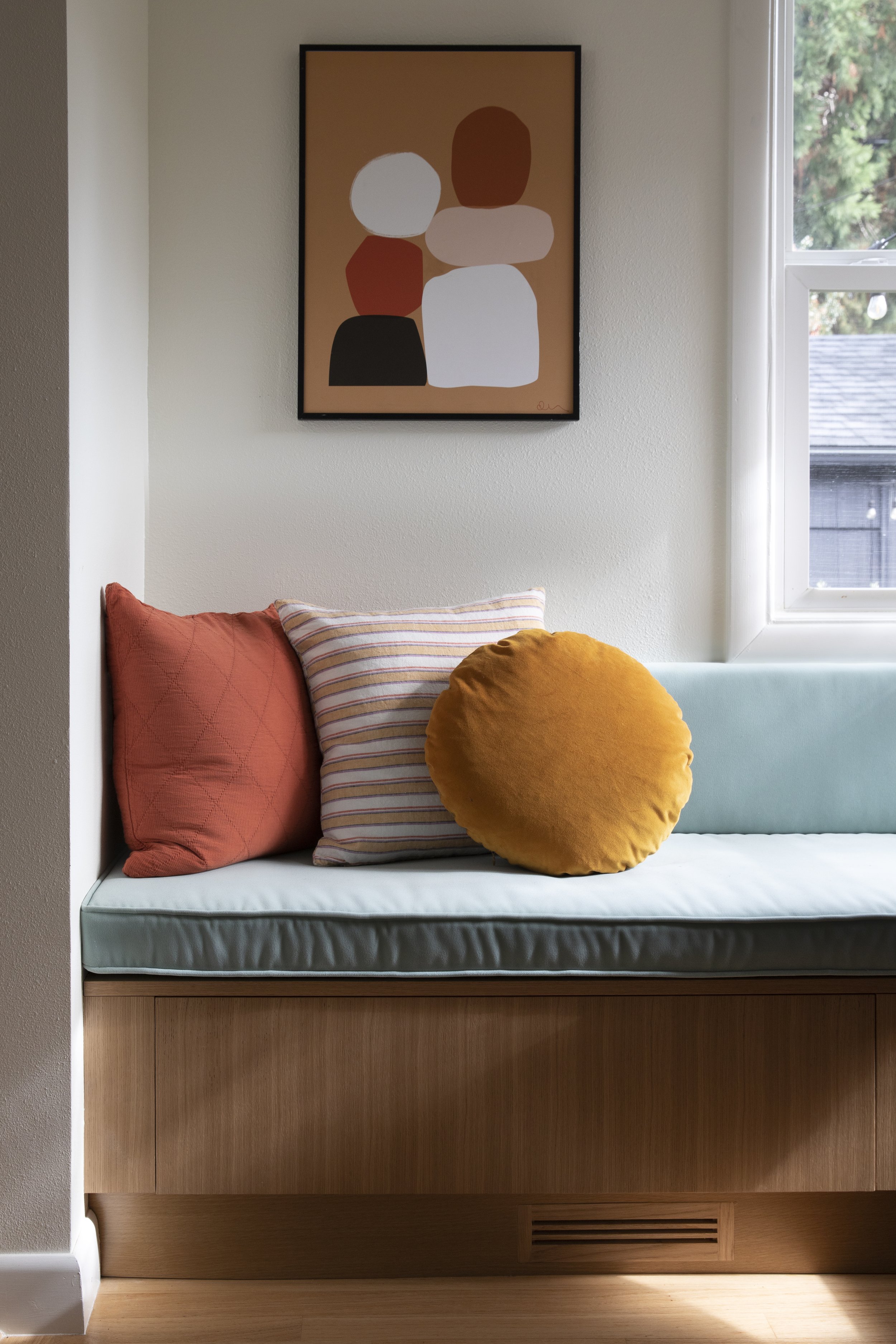
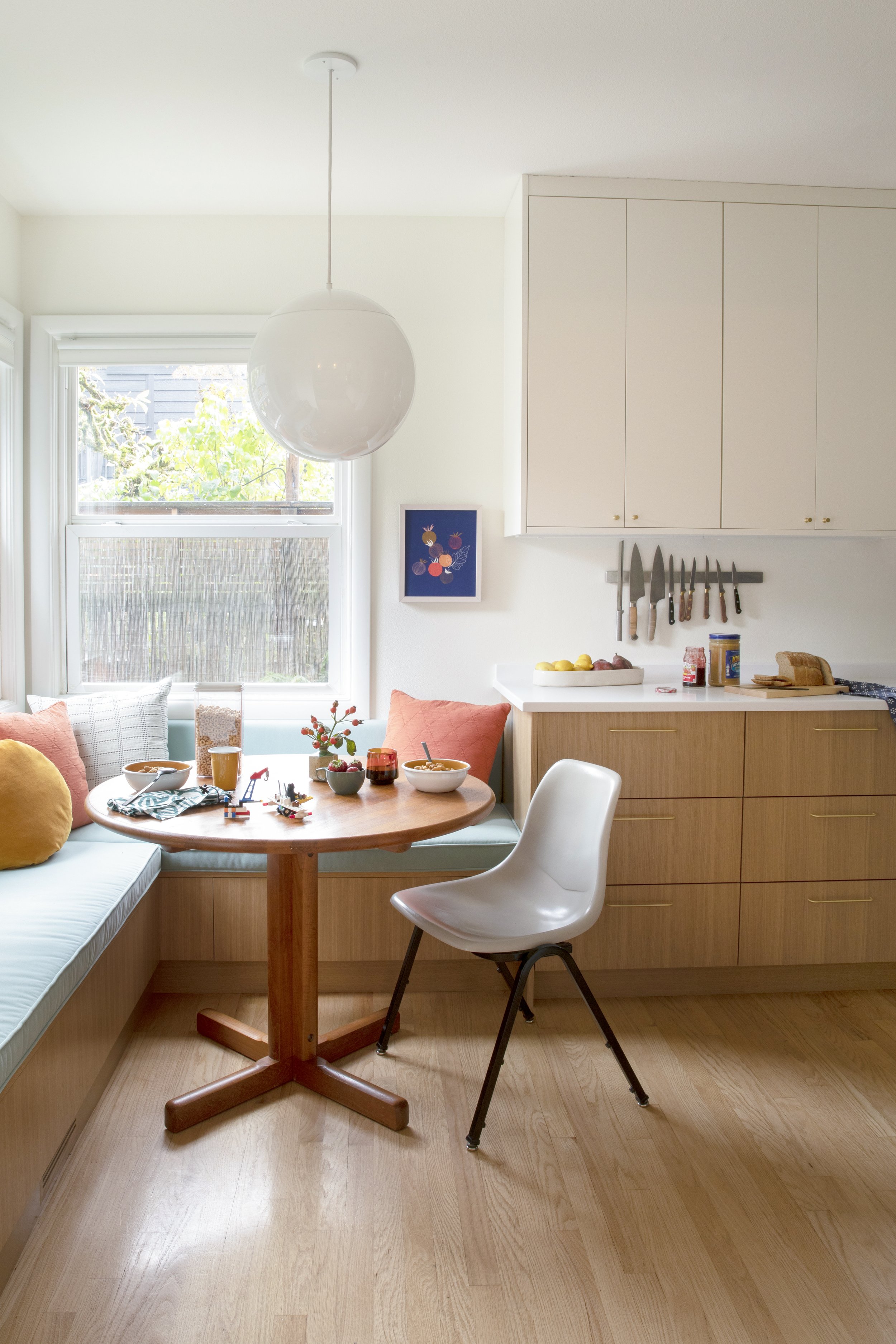
Schoolhouse Electric's Two-Tone Kitchen Design with Kokeena Cabinets

Ready for homework!
When Katie from Portland’s Schoolhouse Electric set out to renovate her own kitchen, she had one goal in mind: create a bright, welcoming space that embraced both style and function. Spending more time at home, it was finally time to say goodbye to the outdated countertops, worn faux wood cabinets, and tired backsplash.
The Challenge.
Katie's wife is the main cook in the household, so the space needed to be highly functional, easy to maintain, and durable, without sacrificing the light and warmth they both wanted. With a tight footprint to work with, Katie focused on smart changes. The first big move? Removing a large, clunky pantry to make room for base cabinets that would create a cleaner, more streamlined flow.
The Process.
After that hurdle, to make the space feel even bigger, Katie opted to extend the upper cabinets higher than the standard height, especially around the range. This small change gave the kitchen an open, airy vibe that made the room feel larger. The two-tone design of the cabinets—with warm oak lowers and white uppers—created contrast and warmth, pulling inspiration from classic mid-century homes.
Read more from the original article here:
The Kokeena Difference.
Kokeena’s Rift Oak and Minimalist doors played a key role in bringing the vision to life. “Their custom cabinet fronts were perfect,” Katie said. “The wood veneer options for IKEA cabinets gave us exactly the look we wanted—high-quality, unique, and timeless.” By choosing Kokeena, they were able to stay on budget while still getting a premium, custom feel for the kitchen.
In the end, the renovation turned out just as they’d hoped—a functional, beautiful kitchen that felt like home. With Kokeena’s custom fronts at the heart of the project, they achieved a perfect balance of form, function, and personality.
Source List:
Cabinets, countertop, hood: IKEA
Cabinet Fronts: Kokeena
Tile: Fireclay Clover
Banquette: custom with Knoll Utopia Windmill
Paint color: Benjamin Moore Simply White
Faucet: California Faucets
Fridge: Beko
Sink: Elkay
Brass rail & hooks: deVOL Kitchens
Under cabinet lights: WAC Lighting
Dining table: vintage


