Palm Springs Mid-Century Modern Kitchen Renovation

A psychedelic oasis in the desert
An amazing mid-century Palm Springs home built by a popular architect had its kitchen remuddled (while the rest of the home stayed intact) during the 80’s, but was brought back to life in all its mid-century glory, with Kokeena as the centerpiece.
It started with homeowner Meredith Gardner who says she wanted a space where she could entertain guests that celebrated the indoor/outdoor Souther California lifestyle and also use as a vacation rental.
The house, an original Palmer/Krisel Alexander home, a popular architectural style in Palm Springs, was built in 1958 and included all the mid-century amenities, like sloped tongue and groove ceilings, big windows facing the San Jacinto mountains, glass sliders that give access to a large backyard, and an inground pool.
The Problem.
Her home’s 1950s footprint had a confined kitchen with walls that separated the kitchen from the living room and a hallway that created a tiny space that could accommodate maybe two people at a time and didn't allow for interaction in other spaces.
Add to that the dreaded dropped ceiling and outdated 1980s laminate countertops, cabinetry, and appliances all made the room feel even more cluttered and claustrophobic.
“I really wanted to open it up so guests could easily converse and mingle throughout the common areas of the home and outdoor space,” she says.
Challenges.
But first? Getting the supplies needed. Those three dreaded words came immediately to mind when asked what the main challenges were: supply chain issues. It was the usual. Many of her suppliers were delayed or out of stock, and the tiles (manufactured in Spain) got stuck in customs at the LA ports for two months. Only half of the IKEA order could be shipped, and she had to take two trips to Covina and another to Vegas to find missing pieces. “We were still missing four of the IKEA boxes so my contractor had me purchase larger cabinets and he cut them down to the correct sizing. Thankfully I had a patient contractor who could work around the delays and would return to the job as the new products arrived,” Gardner says.
The Work Begins.
Once supplies were at hand, the crew completely re-configured the kitchen and removed the walls that blocked it off from the hallway and living room, immediately bringing much more natural light into the space. “After removing the dropped ceiling panels, we discovered the ceiling beams and roof were in their original pristine condition, so the roofline from the living room could seamlessly transition,” says Gardner. The sink was moved under the windows and the stove to the back wall. With the hallway wall gone, they were able to push the kitchen out into the hallway, create a bigger built-in pantry area, and put the fridge along that wall.
They then created an island that gave more countertop space and a spot for people to sit and hang out. To open up the space further, they opted for open shelves in lieu of cabinets and purchased table and drink ware that would add a pink contrast to the green cabinets. The concrete tiles used for the backsplash contain terrazzo and a shape that both harken back to mid-century design.
The Kokeena Difference.
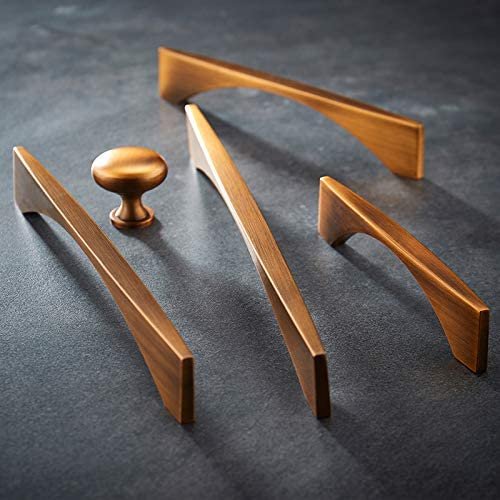
The Kokeena custom cabinet fronts, The Minimalist in Moss paint, fit her mid-century aesthetic perfectly while still looking current. “They also complemented the brass hardware I used throughout the space and the blue and green curtains in the living room,” she says. Once she approved her kitchen design plans, these were sent over to Kokeena who provided her with a detailed product list. Once her contractor assembled the IKEA cabinets, he then attached the custom IKEA fronts.
STATS
Name of project: Psychedelic Springs
Completion date: Summer 2021
Square footage:: House 1,200 square feet
Social media:
@psychedelicsprings
Partners:
Kitchen layout and design: Modular Interior Design Group
Cabinets: IKEA
General Contractor: Alfredo Celballos & Sons (@alfredoceball3)
Products:
Kokeena: Minimalist door in Moss Paint
Backsplash tiles: Tesselle's Ipanema Laranja 8" Square Terrazzo Cement Tile (@tesselle)
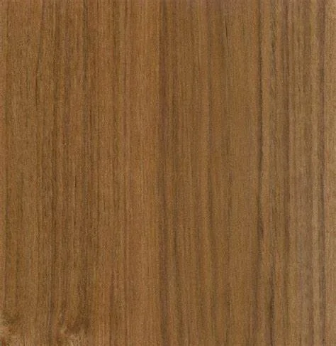
Shelving: Teak from Custom Floating Shelves (@customfloatingshelves)
Drawer pulls and knobs: Amazon brand Goo-Ki
Photography:
Nathan Cox @nathancoxstudios


